
I’ve written a bit about this before (see #2 in this post: https://edrosack.com/2020/06/28/black-and-white/), but I don’t think I’ve ever explicitly revealed the secret.
Here’s the finished photo:
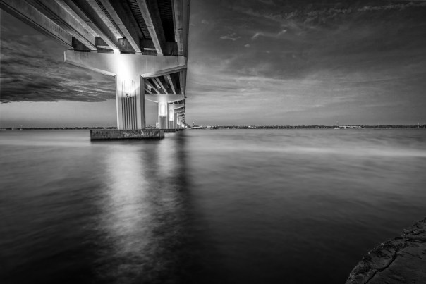 Under the bridge(click to view larger on Flickr)
I like it and the Flickr folks seemed to like it too. It’s a two frame composite blended from these images:


I think the the subject and composition are nice, but the mixed natural light and bridge lighting are too different. I could have tried to use selective white balance (see: https://edrosack.com/2011/10/30/using-selective-white-balance-to-fix-problem-photos/) to fix this, but I think it would have been hard in areas where the colors overlap.
Anyway, today’s secret is that wild lighting can look a lot better in B&W. The Lightroom B&W conversion tool has sliders to adjust the intensity of eight different colors in an image. Wide color differences in the photo combined with all that control gives you a lot of variability and choice when converting to B&W. To me, the B&W lighting in the finished version is much more attractive than the original colors.
Thanks for stopping by and reading my blog. Your visits, comments, and likes are always very welcome and a big motivator for me. Be kind, take care of yourselves and each other. And if the light is wild, make some B&W photos.
©2022, Ed Rosack. All rights reserved
This is exactly why we should think outside the box!
The BW image allows the viewer to appreciate the dramatic sky much more than the color version. Great advice, again.
Hope your new week is a good one, Ed.
Thanks for your kind comment, Wally. I too like the B&W sky better than the color version.
Yes, our week is going well so far. Hope you have a good one too.
Excellent image Ed!!! Is amazing how the mood and perspective change when color is remove. The color image is truly fantastic!!! But the black and white image convey better the scene and doesn’t let the colors distract you from the true reality!
Thanks Samuel. I agree – I find the B&W version much more appealing. I really don’t like the artificial light under the bridge in the color version.
How interesting! It definitely is a dramatic photo in the B & W version! Enjoy your weekend! If these pop up showers stop, maybe we can get out again! lol
Thanks so much for stopping by and commenting Diane!